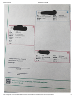
MAKE PEDIGREE FORMATTING A PRIORITY - better format, larger font, more characters allowed to fit
I've had so many complaints about the format of these pedigrees. Font is tiny, hard to read. Not enough characters allowed in certain fields to get all the required info on there (see example - breed type field). Notes section/show winnings difficult to include/format. Spacing isn't even uniform between letters and makes it look unprofessional. Color section is microscopic font. There's a ton of wasted space used on Everbreed advertising - which no one wants to see on their pedigrees. The QR code is fine, but please stop sacrificing space for essential info to fit headers and footers with everbreed ads. I should get money back on my subscription if I have have to allow ad space on my peds. Can we make better formatting (use Evans style as an example) a priority? It's been an issue since the start and should be prioritized higher than adding new features. I can print a 5 gen pedigree in Evans with no problems but can't even get all the required info on a 4 gen Everbreed pedigree.
